
Cue Health
At-Home Health Care Revolutionized
Project Overview
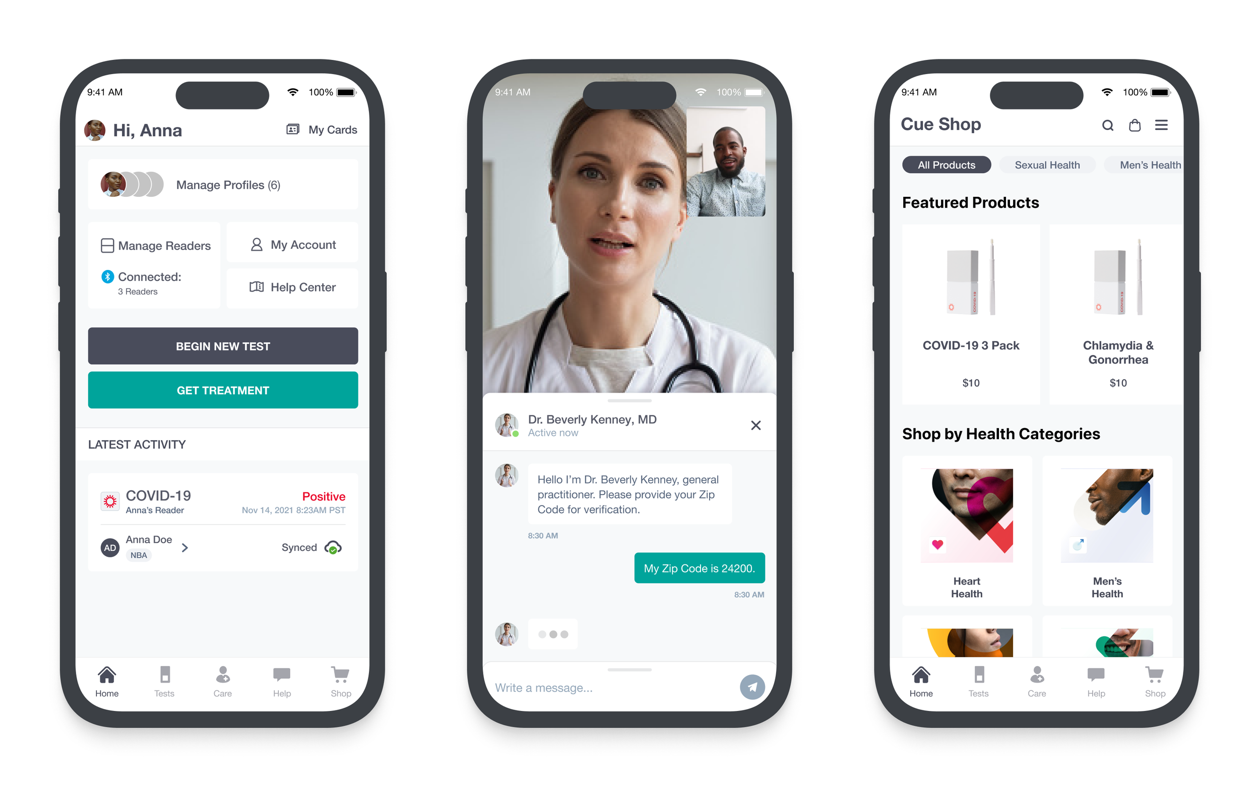
The pandemic transformed the landscape of at-home healthcare for generations to come. Cue Health, an emerging presence in that field, adopted its business through its Cue Reader, which is able to detect the presence of COVID-19 and other biomarkers while providing real-time results through its mobile app. I helped design an expanded market and additional testing on the app and web while managing the design team.
Vision and Scope
In addition to providing Covid testing and treatment for enterprises, Cue turned its attention to becoming a one-stop-shop for all consumer at-home health needs. Barring conditions that require in-person medical care, the platform enables an end-to-end experience, from diagnostics through health monitoring. Cue’s mission is to empower customers to manage their health care from the convenience and accessibility of their homes.
Tools
Figma
OverFlow
Zeplin
Jira / Confluence
Role
As Senior Product Design Lead, I co-managed a design team consisting of four designers in the US and two in Poland, with an additional five we hired from Turkey. With my colleague Ryan, I was promoted to build and manage the team while working on several key features. I was the lead designer on the projects below, and there were other projects running in parallel that I oversaw.
The Existing Experience
Our primary product is the Cue Reader which syncs to the app. Users take a test sample, insert it into the reader, and get the results loaded within 20 minutes. If the test is positive, the app connects to a Health Care Provider [HCP] who prescribes treatment. The business model was initially intended for enterprises, such as MLB and Netflix, for employee Covid testing and treatment.
The intended outcome
As the pandemic wound down, we shifted toward a direct-to-consumer model. As the Cue Reader itself, in addition to the testing kits, is very expensive and not generally used by individual consumers, the business identified the following areas as opportunities for new features:
Diagnostics: Home testing kits for a variety of conditions can be shipped to a lab. Results from the lab will be relayed to the user via the app and if any follow-up action is required, the user can contact an HCP via the app. Cue would white-label the tests and act as a middleman between the customer and the labs, which are run by third parties. Models for this include LetsGetChecked and EverlyWell.
Care: Cue enables its customers to communicate with an HCP either synchronously or asynchronously through the app. Due to the expanded product offering, the app will include new features such as adding insurance, new devices, and bridging the gap between test results and treatment.
eCommerce: Selling prescription medicine through the app, primarily “lifestyle medications” such as ED or STD treatment. These medications require an Rx, and Cue would sync the user to an HCP to write the prescription or upload an existing one from an HCP. Models for this include hims and hers.
E2E Flow
the Understanding End-to-End Flow
My first task was to analyze the existing end-to-end customer experience for COVID-19 and assess how it can be applied to new features. Customers buy test kits, take the test, get results, and if they test positive, connect to an HCP to get Paxlovid prescribed, which is then delivered to their home or picked up. This flow serves as the basis for the new experiences, although each is highly nuanced depending on the medicine..
For the entry point, I considered the mindset of the customer from two angles: “I know what I need” versus “I’m not sure what I need.” This informed the optimization of these screens:
Home: notifications and status updates
Shop: expanded products and categorization
Care: curate an experience to guide the customer to the appropriate product
The Care screen enables users to learn more about conditions, and what treatments are available:
The conditions are categorized, and within each category are tests and treatments
Users can buy tests and non-Rx meds directly by navigating to the Product Details Page (PDP)
Rx meds require the user to complete a medical intake questionnaire and speak with an HCP
Purchasing a test is much more straightforward than purchasing an Rx medication, but we did have to account for cases in which a customer may want to check out both types of products:
For non-Rx products, the user can “buy now” or “add to cart” and continue shopping
Rx meds require the user to complete the medical intake and have it approved by an HCP
these cases will require a different Rx checkout flow to avoid “mixed carts”
Purchase of a test triggers a series of order status notifications that appear on the home screen
The sequence of events is similar to the existing COVID-19 Run Test flow, but must account for:
Sample type (blood, urine, stool, etc.)
Ensuring the user correctly selects and registers the correct test and unique test ID
Allowing the user to select their preferred method of delivery
Notifications via the app once the test is received by the lab and results are processed
Depending upon the nature of the test, the results will be displayed as:
Single Analyte: a single biomarker will be displayed on the Test Details screen
this includes Binary Qualitative results (i.e. positive vs. negative) and Quantitative + Qualitative results (i.e. a number that falls within a given range with a description)
Panel Tests: multiple biomarkers are first sorted on the Test Summary screen, and the user can click on the Test Details screen for more detailed results per biomarker
this includes Binary Qualitative and Binary Quantitative + Qualitative results
Each variation of the results requires a unique UI to display the results and subsequent actions
While in most use cases, only one single Rx is required, there are cases in which two or more may be recommended, so we had to account for getting the user to select the medication to checkout.
The user can adjust quantity, frequency, and dosage on the Product Details Page
The user will be prompted to add additional products to the cart, if required, via a modal
As the laws and regulations for selling Rx meds online differ from state to state, the Rx checkout process had many nuances we had to account for:
adjusted Rx doses and/or frequency that the HCP requested after checkout
canceled or unapproved orders
adjusting the price for any of the above changes and charging or refunding the delta from the pre-authorized charge with clarity and transparency for the user as conveniently as possible
state-based laws and regulations
After an order is processed, the customer’s subscription becomes active and is managed via the app.
Prioritization & roadmap
In addition to the new features and functionality, the CEO decided that the entire app should undergo a stylistic re-design, and the website, which was primarily used for marketing content, should be re-imagined to mirror the app experience in parity. The roadmap assembled looked like this:
Phase 1: release new testing kits to the marketplace, which requires designing how results will display and a new for UI any actions a user may take for a given test result
Phase 2: release new treatment options, primarily lifestyle medications, and consider the medical intake and communication with an HCP flow for each med
Phase 3: Redesign the look and feel of the app, and in doing so, create a new and updated design library while rebuilding the website to support most app-based functionality
Phase 4: introduce a feature that helps users monitor and regulate ongoing health needs, such as weight loss, high cholesterol, or diabetes, via the app
Phase 5: analyze the performance of the new features, reassess, and optimize as needed
Tests
Diagnostics deals with interactions related to registering, taking, and interpreting a test. The first two areas are owned by the marketing team, and I focused on the latter, categorized by biomarker type. The scope includes the activity cards on the home screen, and the test summary and detail screens.
Single Analyte
A Single Analyte test is for a single biomarker, and has two categories:
Binary Qualitative: this yields a binary response, such as “positive” versus “negative” or “detected” versus “not detected”
Quantitative + Qualitative: this yields a numerical value that falls on a given range, and that value determines the nature of the result (i.e. “low” or “high”)
Note that the top row examples (COVID-19 and Vitamin D) offer a treatment, which is depicted in green and can be reached from the results card, as opposed to Colon Cancer (bottom row) where we can only provide Virtual Chat with an HCP and supplemental content in Care. We refrained from showing a negative result on the home screen, and opted for the less alarming “See Results.”
Panel Tests
A Panel Test is a test for two or more biomarkers, and fall into three categories:
Binary Qualitative: the same as above for multiple biomarkers; primarily used for STD tests
Binary Quantitative + Qualitative: the same as above for multiple biomarkers; primarily used for cholesterol, kidney, liver, and fertility tests
With panel tests, there is an additional Summary screen to display each result, whereas Single Analyte tests go directly to the Details screen. Note that the designs above are examples meant to establish a template and pattern to be used by the roughly two-dozen new tests - the building blocks to be used by development who import specific content for each test and biomarker.
Care
Existing Care Screen
The existing Care screen is used to access two general paths:
Virtual Care: allows the user to connect to an HCP via video chat or text for General Health visits
COVID-19: enables a user to upload a positive test result, either from the app itself or an outside source, and get a prescription for treatment
I used this screen as a model for categorizing the new treatment flows and allowing the user to curate their own experience based upon their unique needs.
Primary use cases
Care accounts for all paths to a treatment/action, regardless of if we provide it. For example, we sell Colon Cancer Screening kits but do not have any form of treatment for Colon Cancer, so we needed to establish experience fragments for all use cases to ensure the customer gets the care they require:
The user meets with HCP and is prescribed an Rx we offer > Rx checkout
must account for single and multiple use cases
The user meets with HCP and is prescribed an Rx we do not offer > Rx referral
The user meets with HCP and is not prescribed anything > no action required/referral
All synchronous (video chat) and asynchronous (text message) messaging and history
Categorization
The groupings of these ingresses needed to conform to the same groupings of the product offerings in the shop, but it is important to note that there is not a 1:1 ratio of products to treatments. I mapped out how we would group both tests and treatments within the Care space to easily navigate users to the right product.
Two important changes that developed over the course of the project that impacted the flow chart above are:
the number of products was cut (including all of row 1 above)
it was decided that only treatments would appear in Care and tests would appear in Shop
certain medications could not be merchandized until prescribed, while others could (i.e. we could show ED brands but any of the meds used to treat STDs)
Nevertheless, the flows above served as models for the screens and UI required in Care and were helpful templates for the development team to begin backend work before any wireframes were completed.
Revised Approach
The updated version of the flow chart to the right is more simplified and focused on actionable treatments than the previous model. The primary differences are:
lack of test products
fewer treatment products
fewer categories
the inclusion of the sync and async general health consults
Note that the “merchandized medications” appear in level 2 while the “non-merchandized” medications are never displayed, but the user is routed directly to the treatment flow.
High Fidelity Designs
Along with my colleague Ryan who designed the iconography, I mocked up the screens for the development team to build based. Below are two examples of the Care flow:
Respiratory Health: non-merchandized meds that require the user to input their medical information before identifying the brand and are not available in the Shop
Men’s Health: merchandised meds that are selected by the user, and are also available in the Shop
Web
Minnesota
Although updating the website to enable the functionality above was deprioritized early on, a development that occurred was a contract with the state of Minnesota. The MN Dept. of Health planned to provide free COVID-19 treatment to all MN residents free of charge via our platform, and we were tasked with enabling all MN residents to be connected with an HCP and receive a prescription through a website.
Users
I had to design an interface that is intuitive and accessible to all users. It is highly probable that this site would be used by elderly and disabled people, so accessibility, clear language, and simple interactions were at the forefront of the design. My policy was that if the interface is intuitive enough for a novice user, it should suffice for an average or power user, and I ensured that every screen passed ADA standards and regulations.
Orientation Flow
This project enabled us to translate the experience for the app to the web at a much faster rate, but there were nuances specific to this project that also had to be accounted for. The first thing I did was map the requirements for a user to initiate the care flow itself, which I called the “Orientation” flow. This includes:
Language: the state required four languages to be available: English, Spanish, Somali, and Hmong; if the user selects a non-English option, we direct them to a 3rd party phone service to speak to an HCP
Location: MN residents, if prescribed, get the treatment free while all others have to pay
Platform: in addition to the phone service, users can choose to use the website or the app
The designs above are what the final UI looked like; it helped establish several patterns and rules:
Radio buttons always default to the most common choice
The user cannot proceed until all required form fields are filled in to minimize error states
Content will progressively reveal conditionally based upon the user’s responses, which is more efficient to implement from a development perspective and allows users to modify answers without backtracking
Large text and black on white for high contrast ratio
Responsive designs for mobile and desktop (the wide margins on the desktop breakpoint were intentional for accommodating a wide range of device sizes)
Landing Pages
The content of the landing page was provided by our marketing department, but my team had some say as to the layout and interactions. There were three categories of landing pages:
Primary: where the user lands upon clicking the URL provided by the MN Health Dept.
App Refer Out: prompts the user to download the app
Phone Refer Out: gives the user instructions for contacting OpenLoop, a 3rd party phone service (there were versions of this page in all four languages required by the contract)
Sign In Pages
I used this opportunity to update the login page that was on the website. It is a bit unusual in that it displays both “create an account” and “log in” forms on a single page. In addition to making it stylistically match the new experience, I bifurcated the login and create account experiences, per typical web heuristics. After the first account creation instance, the site defaults to a prefilled login page.
questionnaire
The core of the experience, once the user signed in, was the Medical Intake Questionnaire. The content of the questionnaire is not editable by us and is provided by our 3rd party partners, but we had no precedent for such an experience outside the context of our mobile app. The questionnaire was divided into four sections:
Personal Information
Delivery Preferences (at-home delivery versus pickup from a pharmacy)
Medical Intake
Treatment logistics (such as insurance and post-visit summary)
Aside from having to create the UI for every screen and scenario within the questionnaire at mobile and desktop breakpoints, there were three issues to reconcile:
Refer outs
The conditional nature of the questionnaire
The progress bar
Refer Outs
For a scenario in which a user is ineligible for treatment, I had to provide a message explaining to the user what the issue is, and what action he/she can take. For example, if a patient has shown symptoms for less than three days, we ask the patient to come back after that time period has elapsed. Other scenarios may relate to allergies to certain medications or the age of the patient.
conditional logic
In an effort to avoid making the user click through multiple pages and giving no indication of how many questions will follow, we used the progressive reveal method described above. However, an answer a patient provides may or may not require a follow-up question (for instance, if a patient indicates a surgical procedure that is not listed by clicking “other,” the patient needs to specify which procedure).
To account for this, I recommended we reveal additional questions only if certain responses are given. That way, the form is updated in real-time and the user understands where they are in the process without breaking the flow. As it turns out, this solution is simple from a front-end perspective.
Progress Bar
I suggested using a Progress Bar throughout the experience. My idea was to display each question on a different page and move the bar progress incrementally. I realized this would create too many pages, and I switched to the progressive reveal model assuming the progress bar could still function the same way.
However, due to the conditional logic, the developer told me that a percentage-based change in the progress bar requires more time to implement than we had available. My solution was to have the progress bar remain static within a section but show progress from section to section. Although it won’t show the overall percentage completed, the user will still be able to gauge the number of questions on the page.
Post Visit
After the session, the customer gets a visit summary outlining the information that was collected and the results of the visit. If meds were prescribed, the subscription is managed via the app. The post-visit, subscription management, and Rx checkout flows were handled by a different designer, although I supervised the work throughout the process and implemented it into my documentation.
outcomes
All told we delivered the project within the 5-week timeline, from receiving the initial requirements through implementation and launch. As a result of my work, we had several positive outcomes worth noting:
The MN Department of Health renewed our contract for two years after seeing the website
The company was set up to pitch similar contracts to other states based on this model
I created a big part of the E2E experience, thus reducing future scope for the website
The web designs now matched the app’s look and feel, which was not the case previously
Conclusion
Reflection
As I demonstrated above, my responsibilities as the lead designer covered many areas. All the work shown above is my own, but there were other areas of the experiences that I helped to supervise but were led by other designers, including the checkout and subscription management flows. Additionally, other designers were responsible for unrelated areas of the product, such as enterprise or marketing flows. During the course of my tenure at Cue, while I worked on the projects above, I became involved in other areas:
creating a pod system to manage work assignments and PM-designer pairings more efficient
defining the workflow from product —> design —> engineering —> QA to better define goals, design consistency, and a clear source of truth
interviewing and hiring new international team members
planning and executing usability research efforts
preparing for a company-wide redesign that is driven by user research and industry standards
This experience gave me my first opportunity to manage a team while also balancing the needs of my projects. I was very proud to see the new and improved Cue experience come alive both on the app and on the web, and know that residents of Minnesota are receiving the care they need, in part, due to my efforts.